[ Context ]
Compare rates, then talk to a carrier
Globy is a B2B marketplace for global wholesale trade, with about 60,000 traders in 120 countries. Its logistics tools let traders compare freight rates and contact carriers. Globy only aggregates rates and doesn't carry cargo.
The challenge. Get a shipper from “what will this cost?” to a conversation with a carrier in as few steps as possible.
[ Results ]
What the live calculator does
Live on globy.com and used every month: thousands of searches turn into about a hundred inquiries for carriers.
~23,500
Unique visitors per month
May–Aug 2026
~3,577
Searches per month
Jul–Aug 2026
~97
Inquiries per month
Jul–Aug 2026
Roughly 15% of visitors search, and about 3 in 100 searches end in an inquiry. The periods differ, so these ratios are rough.
[ Research and process ]
What other tools do, and how people move through the calculator
I compared four freight-rate tools (Freightos, Shipa Freight, iContainers, SeaRates) with Globy. Three gaps shaped the design:
- Modes are usually split. Most tools lead with one or two. Globy puts sea, air, road and rail under one search.
- Sign-up is the gate. Competitors ask for an account to book. Globy lets guests explore first.
- Price caveats are easy to miss. Rates are often one number. Globy labels what is indicative.
COMPETITOR ANALYSIS
Four freight-rate tools compared with Globy
| Freightos | Shipa Freight | iContainers | SeaRates | Globy | |
|---|---|---|---|---|---|
| Transport modes | Ocean, air, trucking | Air, ocean, road | Ocean (FCL, LCL) | Sea, air, rail, road | Sea, air, road, railways |
| Results view | Quotes side by side | Instant quote with transit time | Rates by carrier and sailing | Rates with carrier and transit time | Own page and filters per mode |
| Price transparency | Instant rate, extras later | Cost breakdown | Total with included charges | Rate with validity period | “Indicative” and “Subject to” labels, route legs |
| Without an account | Quote, account to book | Quote, account to book | Account to book | Sign-up for details | Guests search; gates at limit and chart |
| Next step | Book online | Book online | Book online | Request or book | Request, pre-book or contract rates |
| When nothing matches | Contact sales | Contact sales | Custom quote | Request a quote | Quick Request form |
User flow
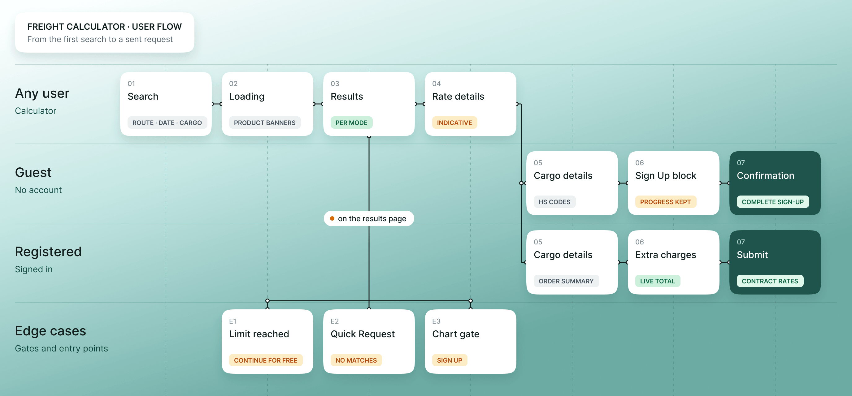
I mapped the path from search to a sent request, plus the edge cases: no matches, the guest limit and the chart gate. The final set is more than 90 screens, desktop and mobile, and covers every state a user can land in, from loading to the guest and registered steps.
Solution design: from landing page to first rate
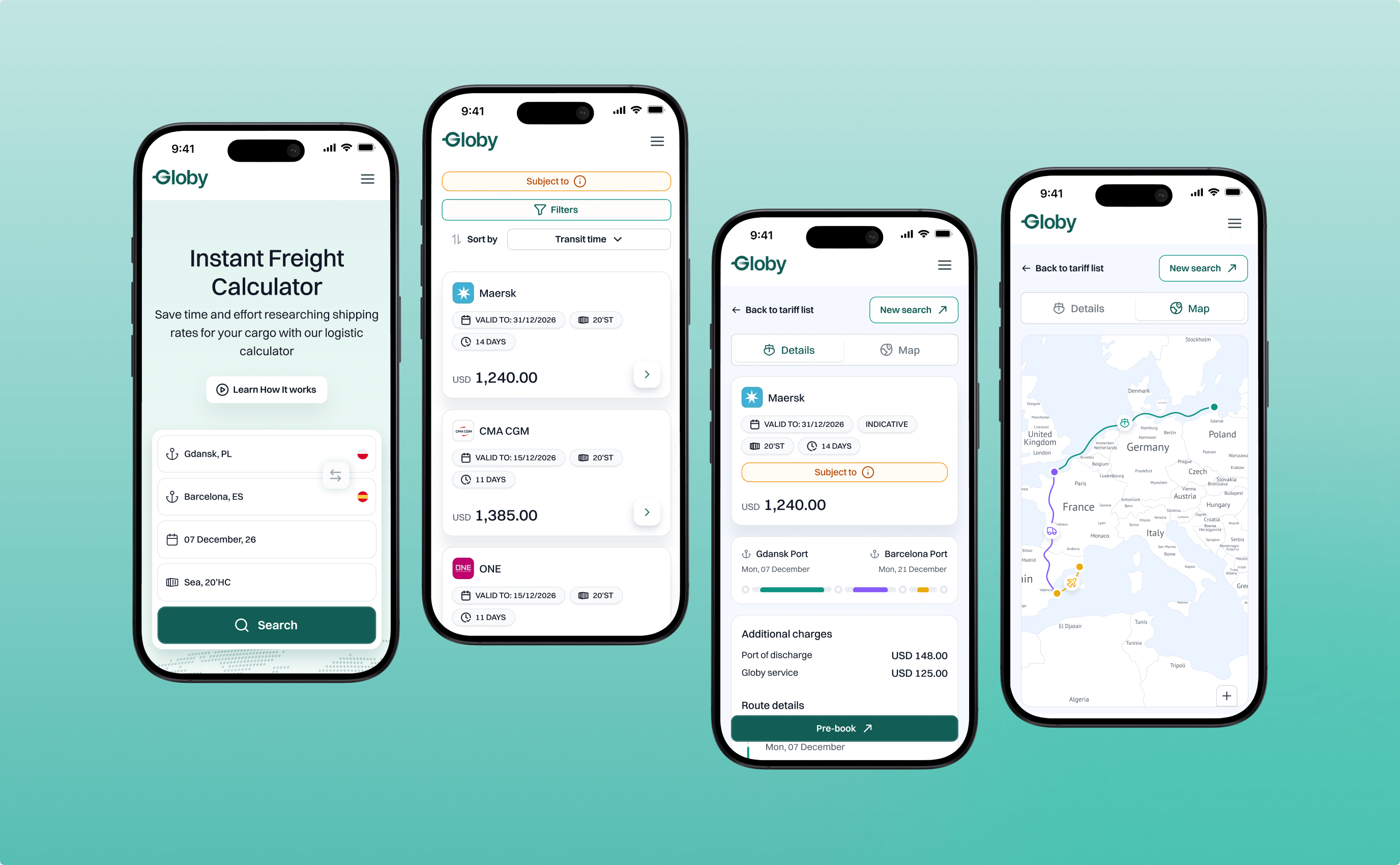
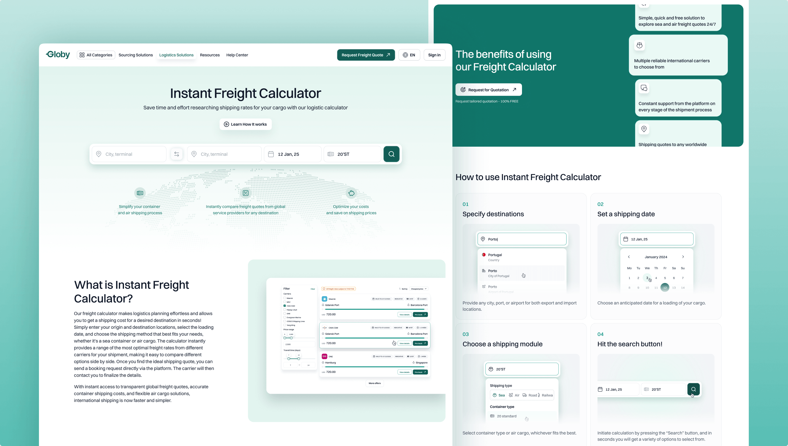
The goal: a visitor reaches a first result in one step and understands the tool without a tutorial. The landing page has a hero search, an explainer, benefits, a five-step guide, an FAQ and a destinations browser. While rates load, banners for other Globy products fill the wait.
[ Key design decisions ]
Five decisions that shaped the tool
One search for every transport mode
The problem
Sea, air, road and rail rates sit in separate tools with different forms, so people compare them one by one.
The solution
The search bar stays the same: from, to, date and shipping type. Only the last field changes: a container for sea, weight and volume for air, a truck type for road, a load type for rail.
Each mode has its own results page, filters and accent color (amber for air, purple for road, blue for rail).
Why it works: one form keeps the learning cost low, since only the last field changes.
No dead ends when nothing matches
The problem
A search with no results ends the visit.
The solution
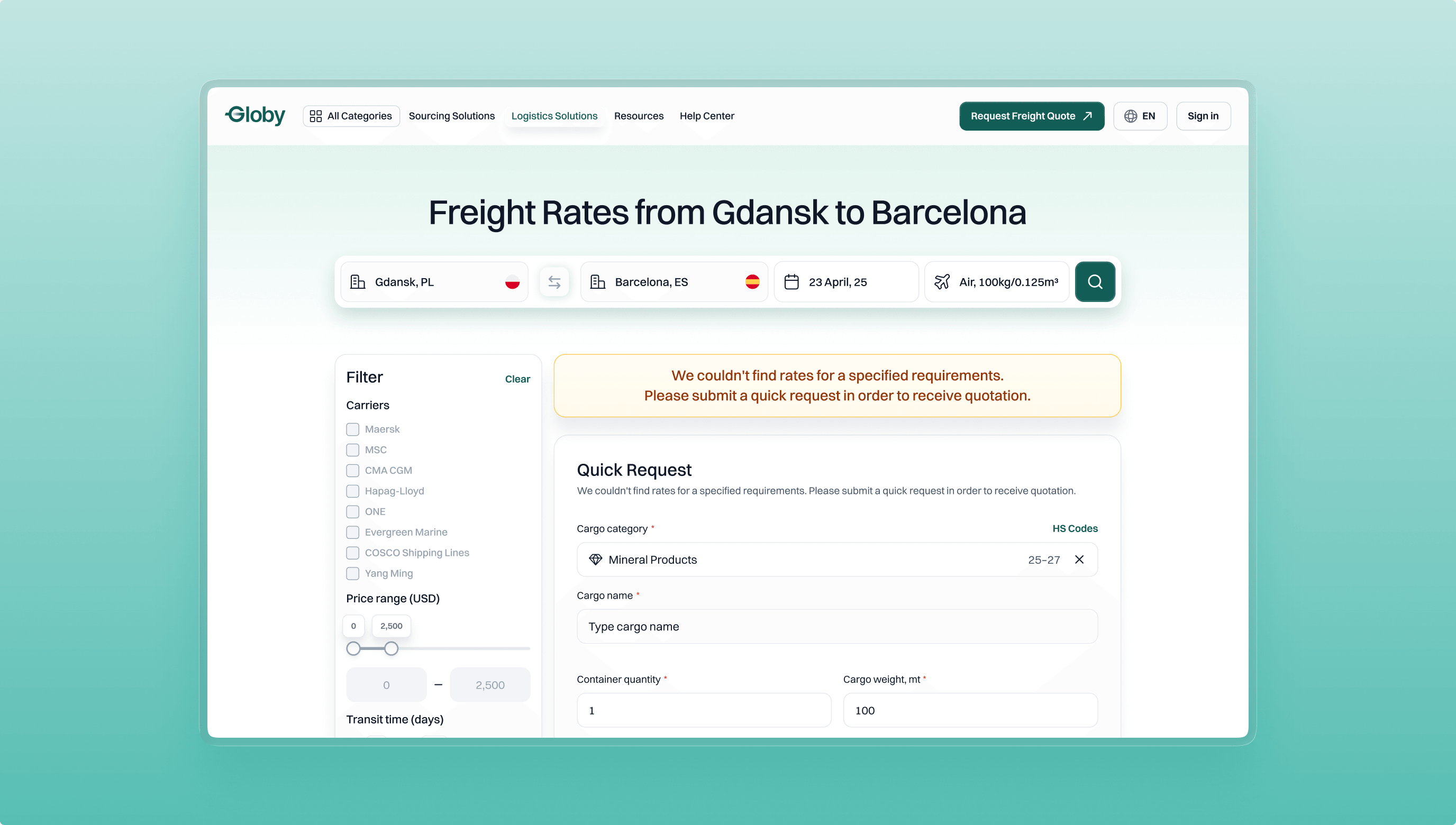
The empty state opens a Quick Request form: cargo, quantity, weight and contact details. A “Want to explore more options?” card under regular results offers the same shortcut.
Why it works: the empty state becomes a way to reach a carrier. The form asks what a carrier needs to quote.
Free to try, register when it counts
The problem
An account wall before the first result puts people off.
The solution
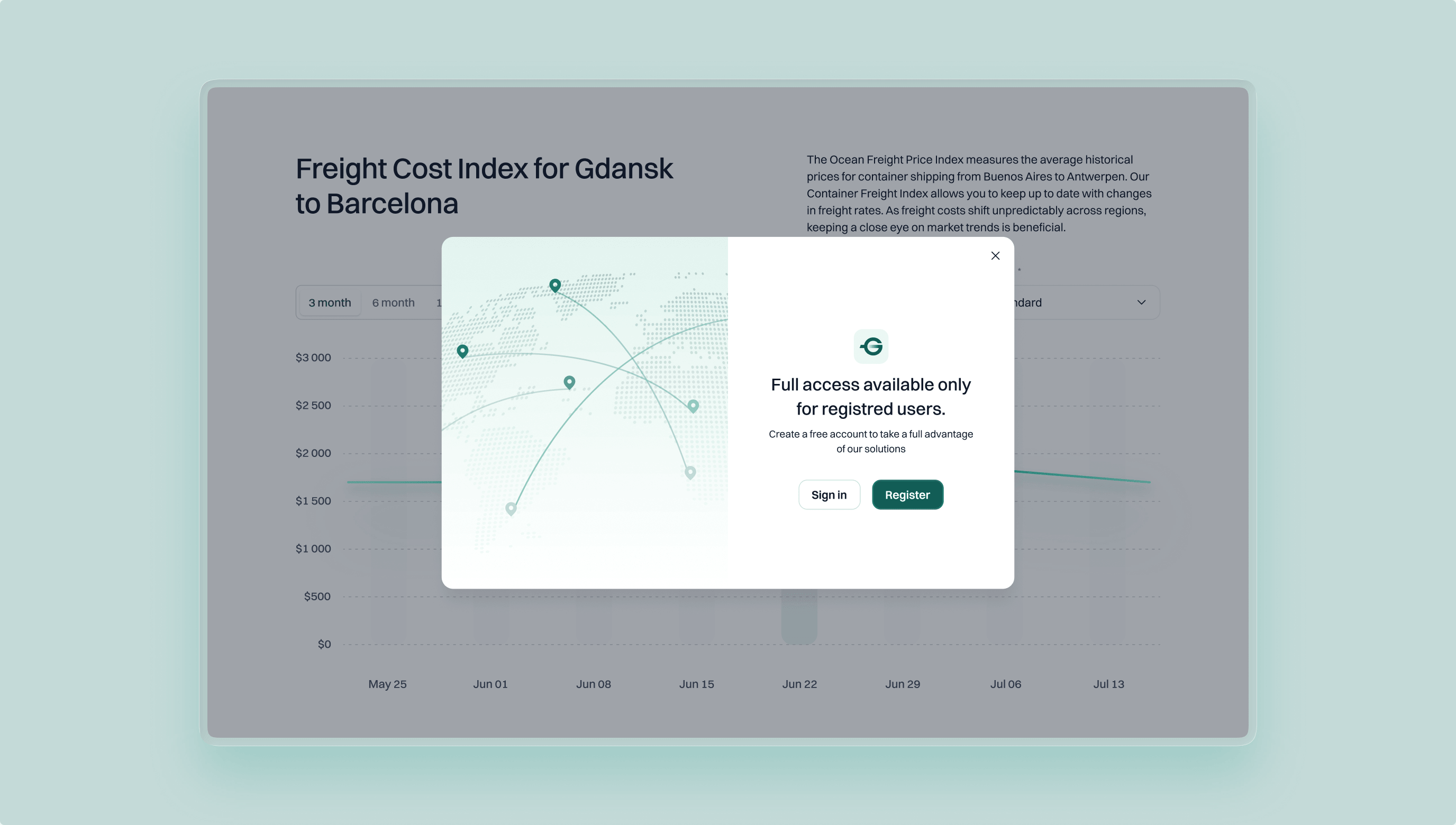
Anyone can search without an account. Registration appears twice: at the search limit (“Continue for Free”) and on the Freight Cost Index chart. Both are modals, not walls, and Sign in sits beside Register.
Why it works: browsing stays free, and sign-up reads as a fair trade, not a toll.
Say what a price really is
The problem
Carriers confirm the final price later, but a single number reads as a promise.
The solution
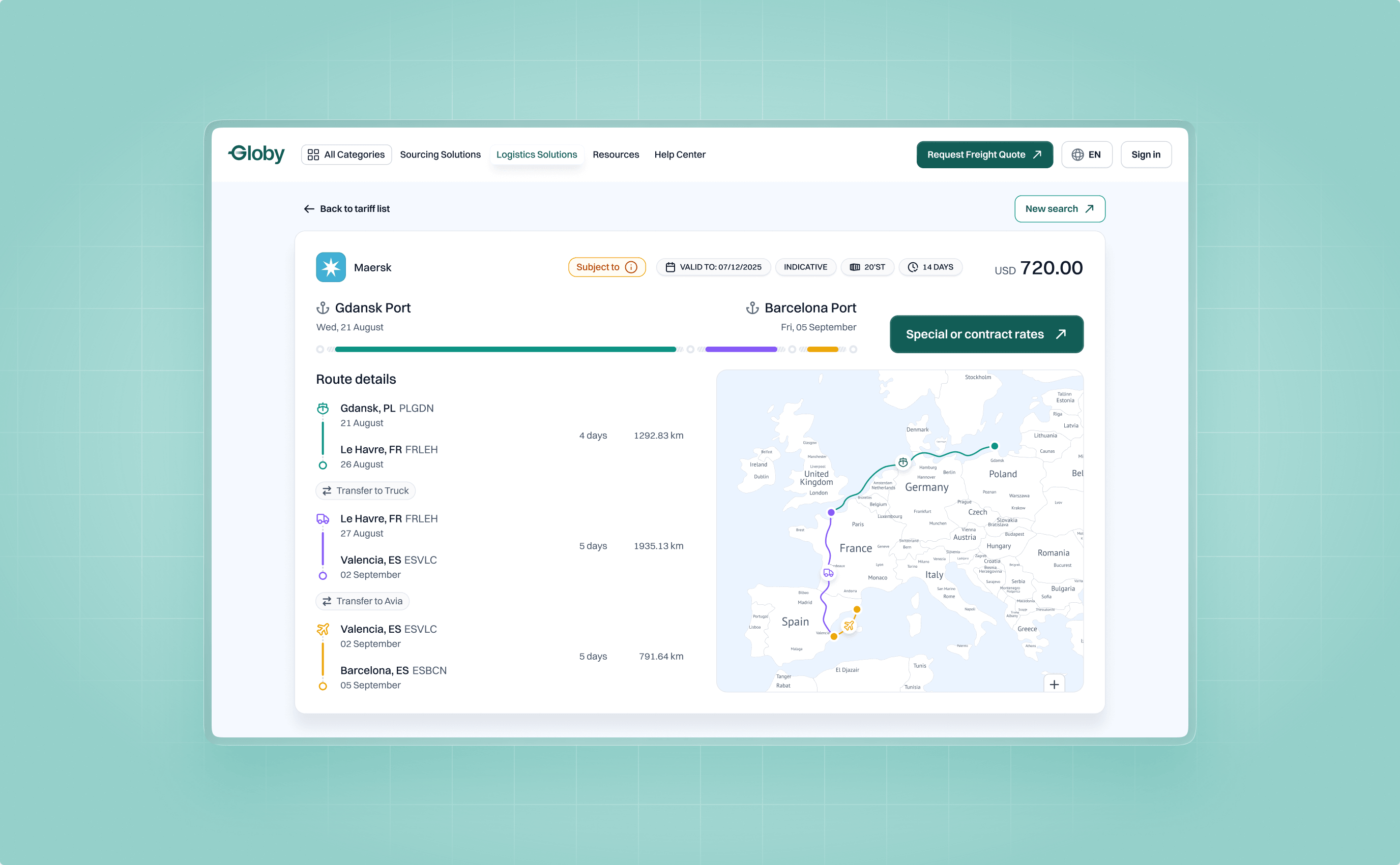
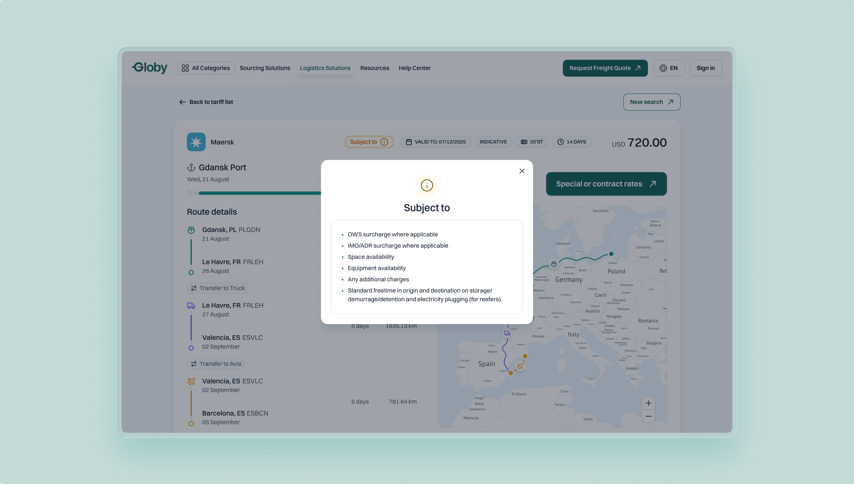
The interface says so: every rate has an “Indicative” label and a validity date, and an orange “Subject to” tag opens the conditions.
The details page splits the route into legs on a map and lists port charges separately.
Why it works: a labeled indicative price is less likely to feel like a broken promise.
One form that adapts to the cargo
The problem
Different cargo needs different data, and customs terms like HS codes are unfamiliar.
The solution
A rate opens a single page: rate card, cargo details, additional charges and a side order summary. The user picks a cargo type, and the fields change to match it. Each type asks only for what a carrier needs to quote it.
If the user doesn’t know the category, HS Codes search finds it: type a keyword or browse by chapter, then select the code.
Why it works: the form asks only what a carrier needs, and category search helps people who don’t know customs terms.
[ What didn’t ship ]
An interactive destinations map
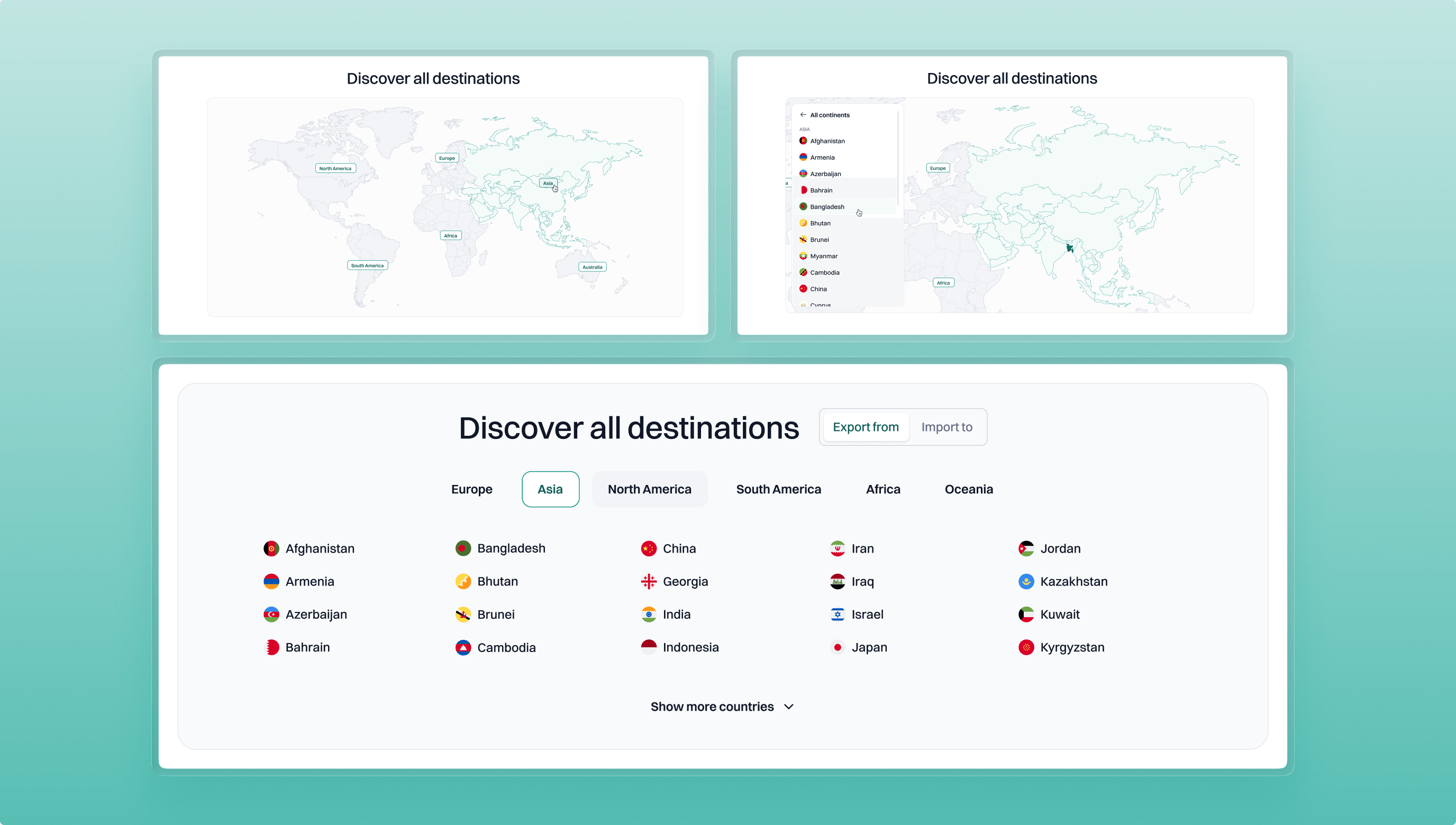
I also designed an interactive destinations map: pick a continent, then a country, and a panel lists its cities and routes.
It was cut for implementation cost. The shipped version keeps the idea simply: continent tabs with country lists, and a catalog of routes by country.
[ Reflections ]
What I would take to the next project
- Design the empty state first. When a search finds nothing, a quick request keeps a path to a carrier open.
- Gate with a reason. Registration appears where it unlocks something: more searches, the chart, a saved request.
- Say what a price is. Indicative and Subject to cost some space and buy trust.
- Ask only what the cargo needs. The form changes with the cargo type, so each user sees only the fields that apply.
- Treat scope as a design material. The destinations map was too expensive to build at that stage, so I shipped continent tabs with country lists. They kept the idea at a fraction of the cost.